Yesterday I waded through a pile of portfolios, and after a deep breath, took to twitter
“I instantly turn down portfolios that include design process diagrams, just FYI. It’s a job not a journey to self-enlightenment.”
It seems to have made a whole bunch of people pretty angry so I thought I’d qualify what I meant and why I still think it, though I was being more being more extreme than I probably should have been, or meant to be.
Hiring designers is hard. Anyone who’s done it will know it’s almost impossible to tell all the qualities you’re looking for by looking through some names and dates on a CV and some pictures in a portfolio.
The reality is, you hire on attitude and potential as much as previous experience and the two big things I look for between all the desaturated pictures and big-client names are someone who always questions what they’re being asked to do, and who measures themselves by the actual outcomes of that questioning.
Most designers do this first one naturally, and if you’re like me and your outcomes become increasingly non-physical or intangible as your career progresses – will try to think up ways of showing the second.
In the last 5 years though (maybe it’s longer) there seems to be some kind of mass-misunderstanding in design – mostly within service design – that the process by which you actually get to that outcome is somehow as valuable as what you’ve actually achieved.
Don’t get me wrong – what you (and possibly your client or the people around you) learn along the way makes you the person, and designer/s you are. In fact, the best designers I know are almost in a constant state of self-inquisition in order to make sure the decisions they make are unbiased and meet user needs. They’re always learning and crucially, always helping others to learn around them.
But to your users, what you actually make or achieve is the only thing that matters.
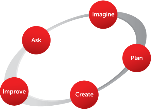
And that’s why I hate design process diagrams. They can be double diamonds (they usually are) circles on a line or a weird giant squiggle (I’ve seen a few of these lately) what they scream to is that you care more about yourself, your process, your ‘learnings’ than you do about outcomes you’ve made and the impact you’ve had on users.
If there’s one thing you need when you design things to make people’s lives better ( in the public sector or private) is an unwavering sense of unselfishness and commitment to making things better for users. So when I look through portfolios I look for people who show that’s what they care about too.
Design isn’t the type of labour you can quantify in the number of weeks you spend getting to something. Something worthwhile can take minutes or years, what matters is that you get there.
If you want proper advice on what a good portfolio looks like, rather than my ranty thoughts, Stephen McCarthey and Mark Hurrell have both written excellent guides.
